Brand identity by Monogram
Yūgen — a sushi brand identity by Monogram.
Some brands are built to be loud.
Yūgen was built to be felt.
The name comes from a Japanese idea: a quiet depth, a beauty that is not fully explained at first sight. Something subtle, restrained, but impossible to ignore.
That became the core of the identity.
What we did
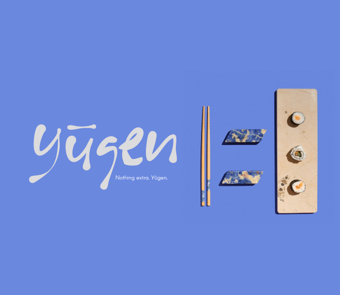
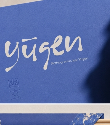
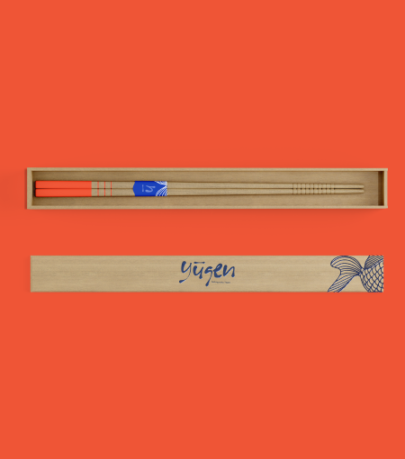
A soft handwritten logo gives the brand its human rhythm.
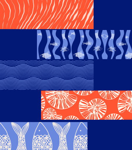
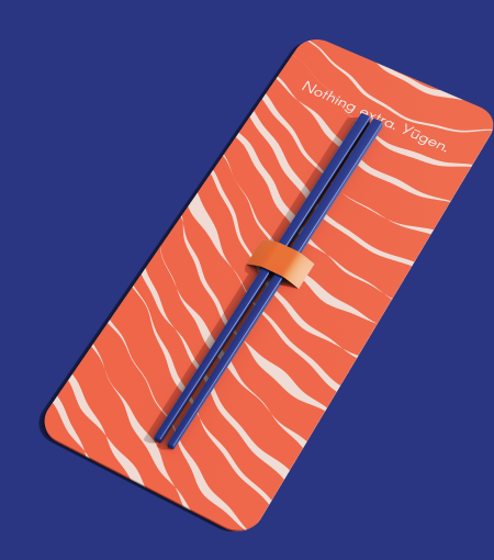
Deep blue brings calm and confidence.
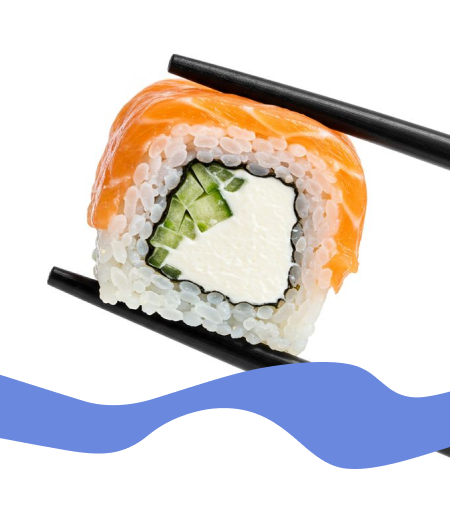
Orange adds the energy of salmon, appetite, and contrast.
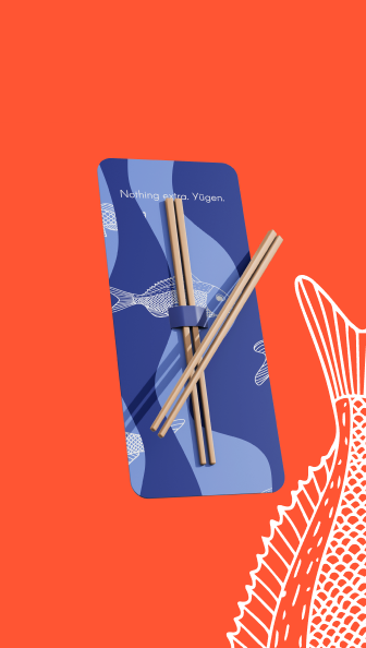
The patterns are inspired by movement — fish, water, cuts, layers — creating a visual system that feels organic, sharp, and alive.
Yūgen is not about adding more.
It is about knowing what to remove.
A brand identity built around restraint, taste, and quiet memorability.
Nothing extra. Just Yūgen.
Our Solutions
- Brand Identity Design
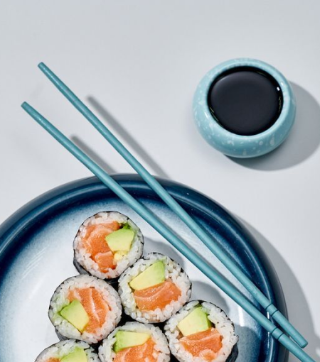
And here is the result
*

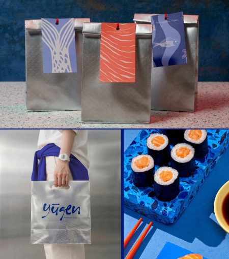
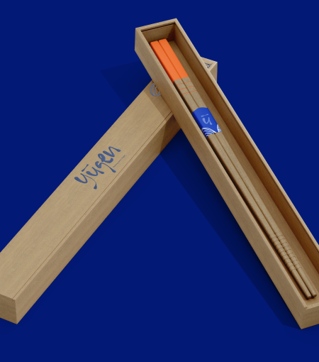

Brand in Action
*